
TOM: On-the-Go Food Management
TOM is a mobile app designed for young adults to simplify the grocery shopping experience and manage food inventory with smart organization, reminders, and a playful, easy-to-use interface.
Drag them around!
Young adults are learning to manage food as a part of growing up…
Existing tools are built for people with more time: they either lack a seamless flow across shopping, storing, and planning, or are overly function-driven and misaligned with real-life behaviors.
How might we help young adults turn the scattered chores of food management into a smooth and rewarding routine?
High-level goals that defined my design
Bridge what users buy, have, and need.
Combine convenience with delightful interface.
Give users better visibility into their food.
TOM streamlines grocery shopping and food tracking by turning shared lists into a smart inventory

On-the-go Grocery Lists
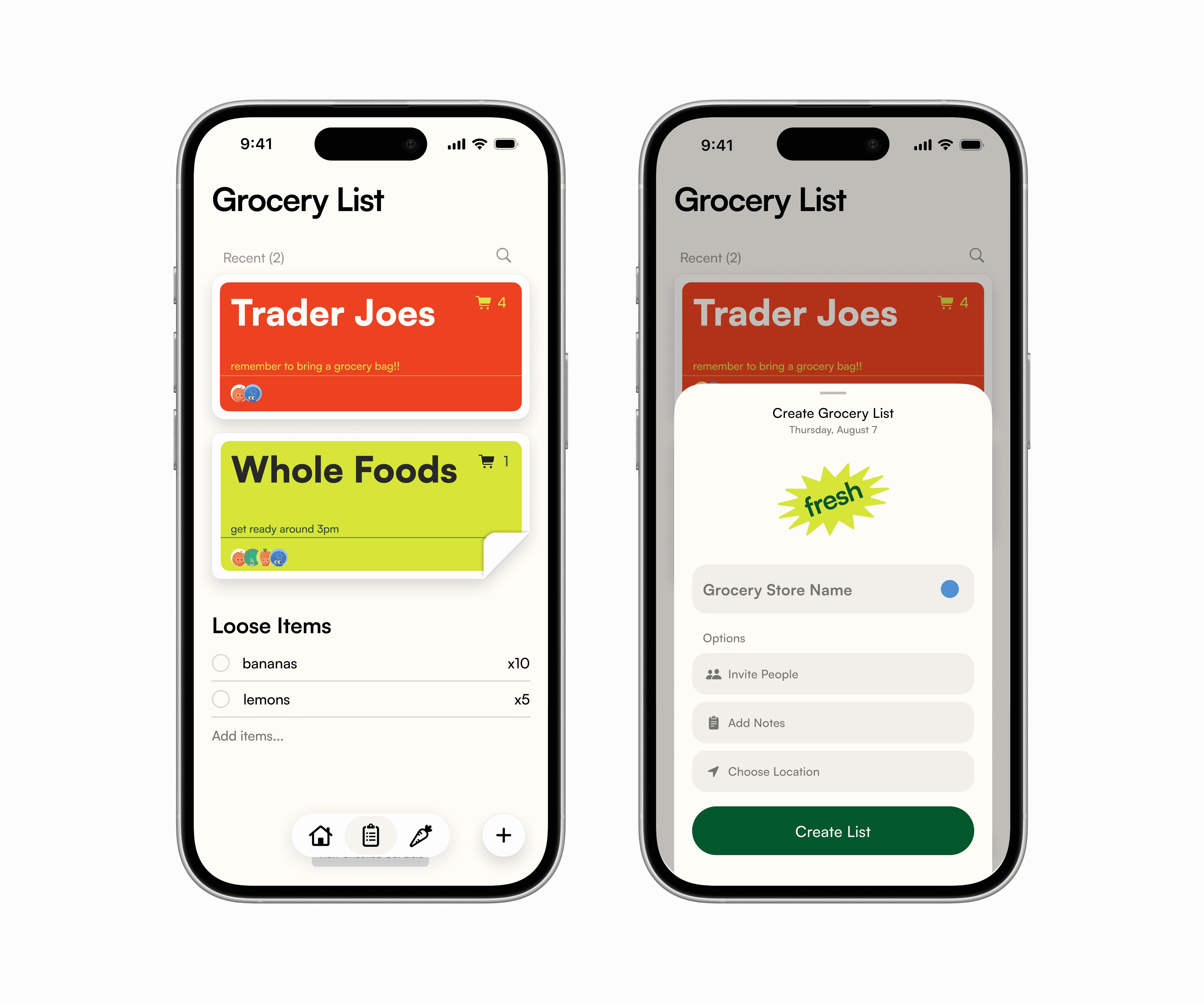
Tom integrates a shop view that allows users to create checklists sorted by grocery stores, share with friends to edit in real time, and check out once purchased.
Inventory & Freshness Tracking
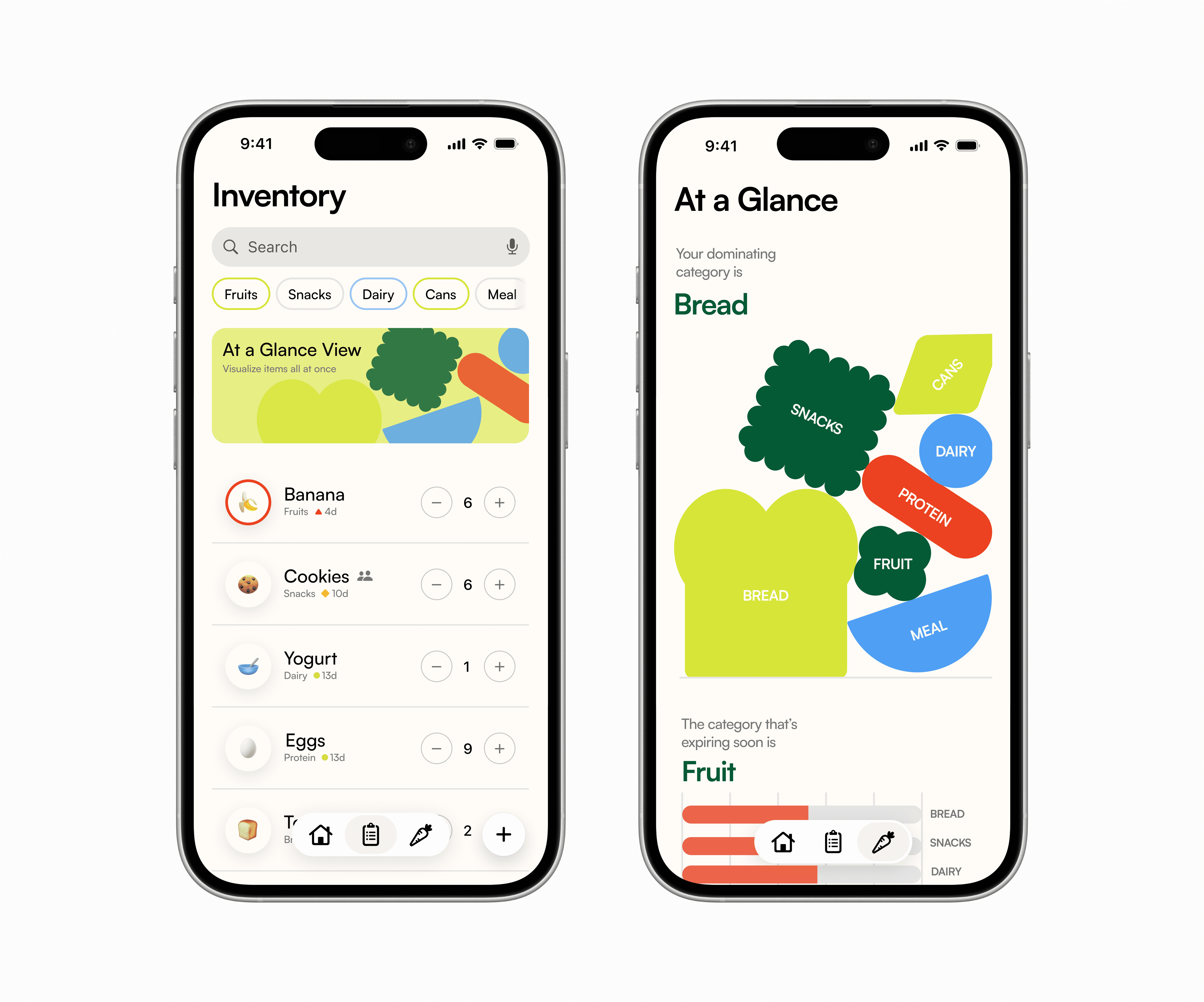
The built-in smart inventory system keeps track of your checked-out grocery items and sends reminders before items expire.
Research
We conducted interviews and sent out a survey to 20 young adults (ages 20–30) across the U.S. to understand how young adults manage food (or don’t).
Through asking open-ended questions, we gathered information that addressed our users’ overarching lifestyles, food management + grocery shopping behaviors.
Patterns
70%
reported finding expired food at home “very often” or “sometimes.”
> 50%
admitted to duplicate purchases & found the process frustrating.
75%
relied on mental notes or nothing to track lists.
Read more about user research and competitive analysis here.

Design Explorations
Navigating between tabs
Before landing on the bottom navigation bar, I explored a card-only interaction structure for the app's core flows to keep a visually simple interface.
While this approach reduced clutter, a nav bar worked better for switching within a single context than for moving across the broader product.
Shop List Layout Designs
The shop function started as my personal frustration with documenting loose grocery lists into the notes app every time I go shopping. Although it was quick, there was no way to organize the items, resulting in a collection of messy lists and loose items.
My design principles for this section are:
Prioritize on-the-go usage
Incorporating core organizational methods
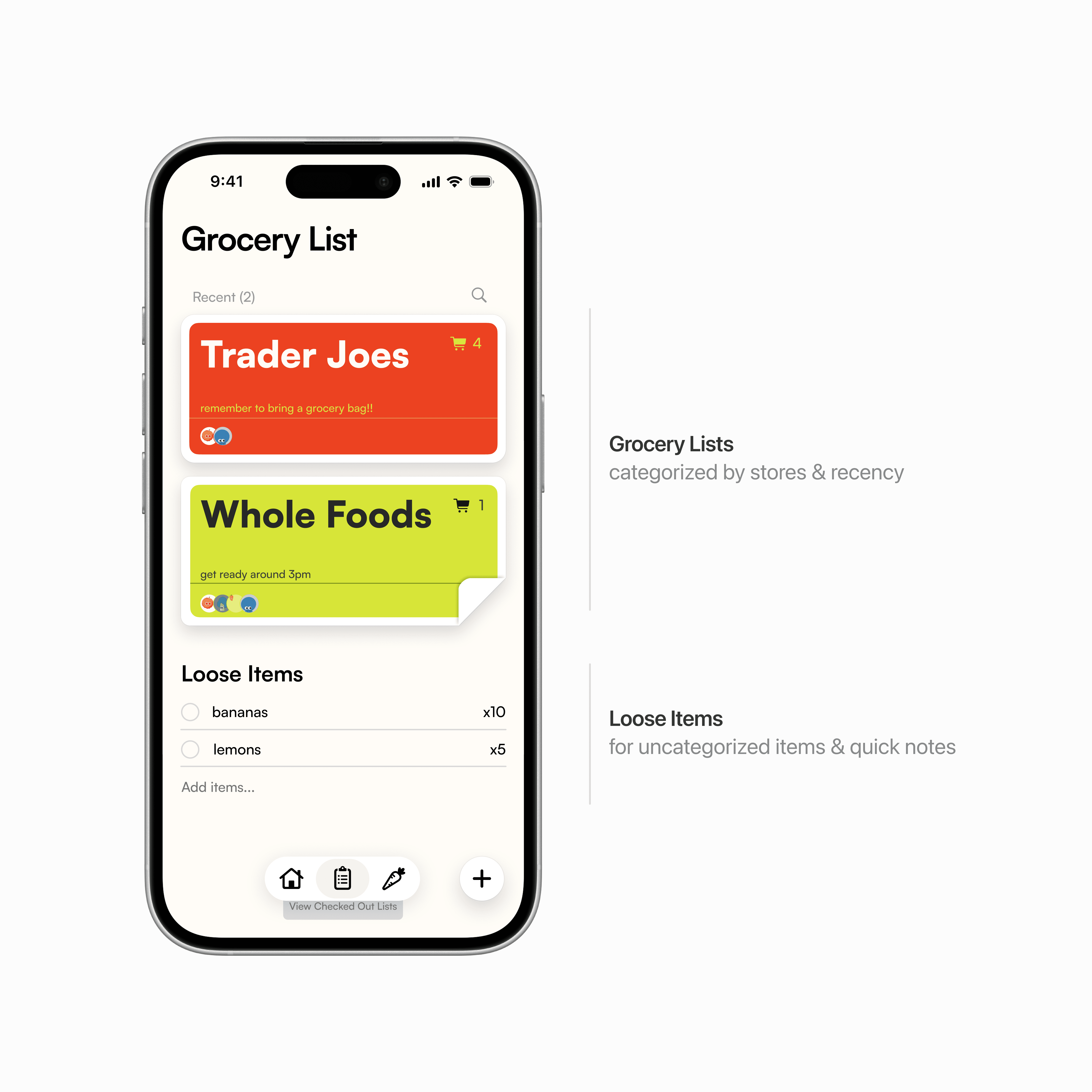
Data Visualizations
Existing inventory views make it easy to check single items, but fail to show the bigger picture of stock and expiration. One of our research participants claimed,
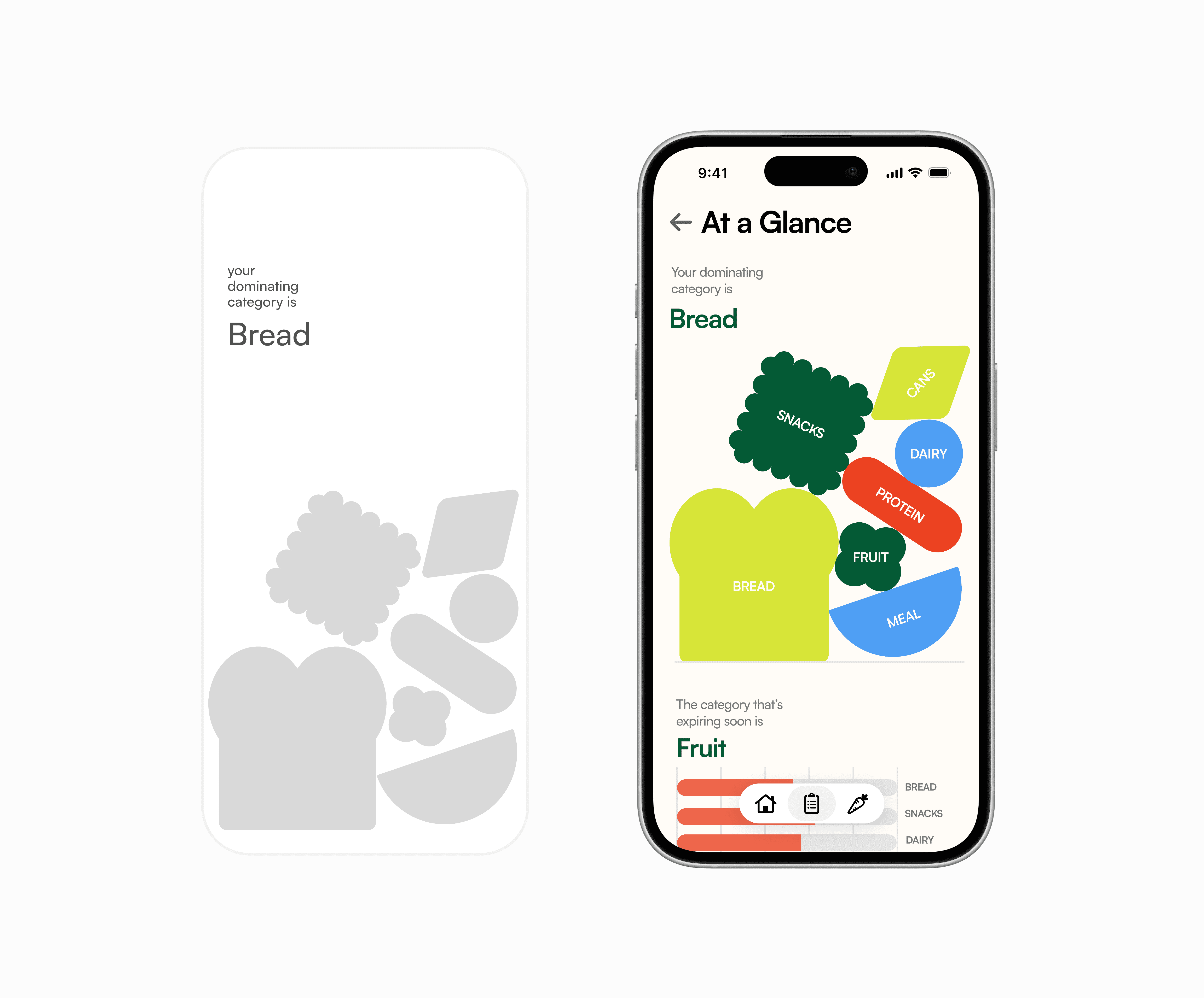
I want a high-level visual summary that highlights key categories and expiring categories without scanning every item.
I explored representational, abstract, and elementary shapes to represent various food categories.
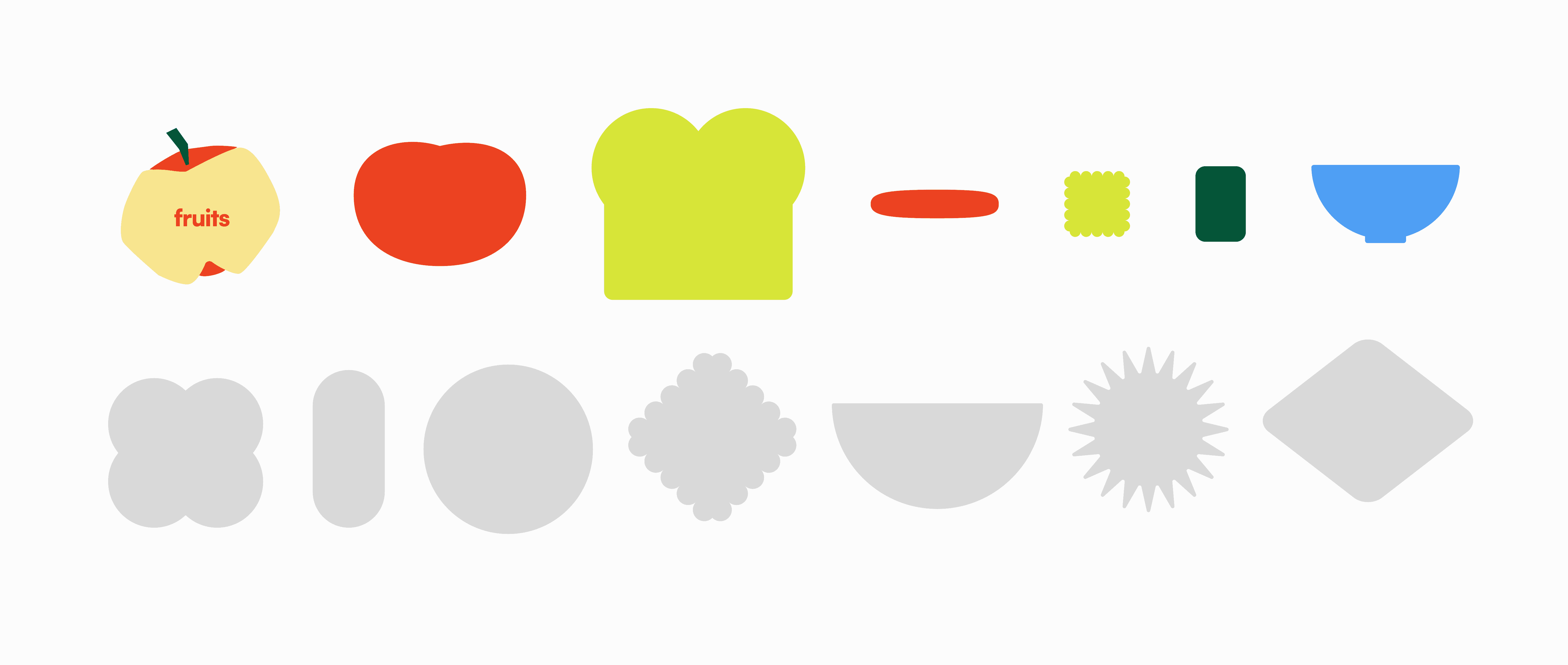
Then, to balance playfulness with clarity, I experimented with various layouts to find the right balance between a "fun" aesthetic and functional data.
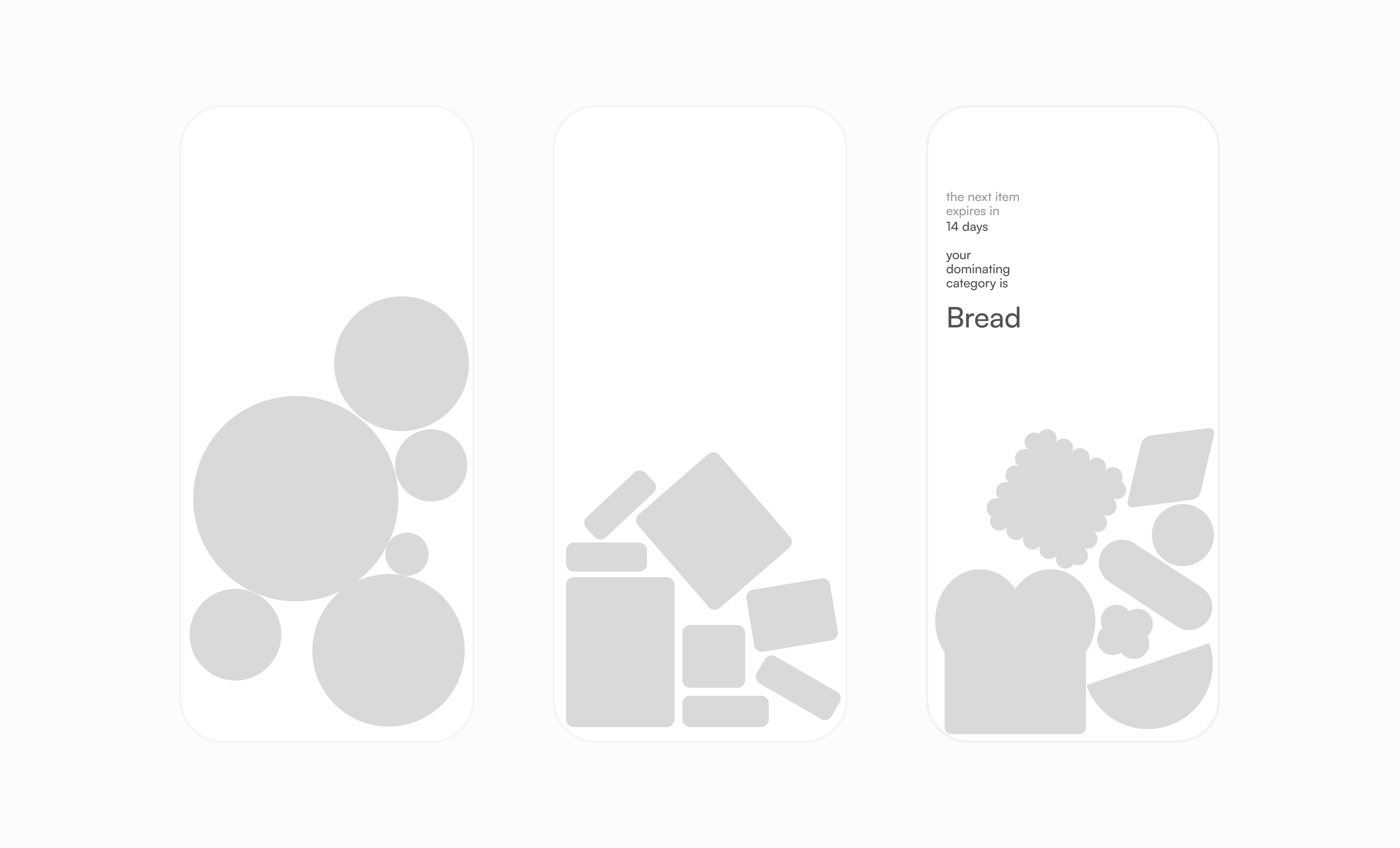
I redirected back to the abstracted food-inspired shapes for a more on-brand but also scalable system.
Next Steps
While TOM remains a concept idea, we want to understand and quantify how it could perform in real life. The next phase will focus on structured user testing and data-informed interactions.

